5 Poorly Conceived Landing Pages that Will Make Your Head Spin
There are great landing pages, and then there are those that are simply bad. While you can take inspiration from the good ones, you can also learn valuable lessons from the bad ones. Here are five examples of truly terrible landing pages that make mistakes you never should:
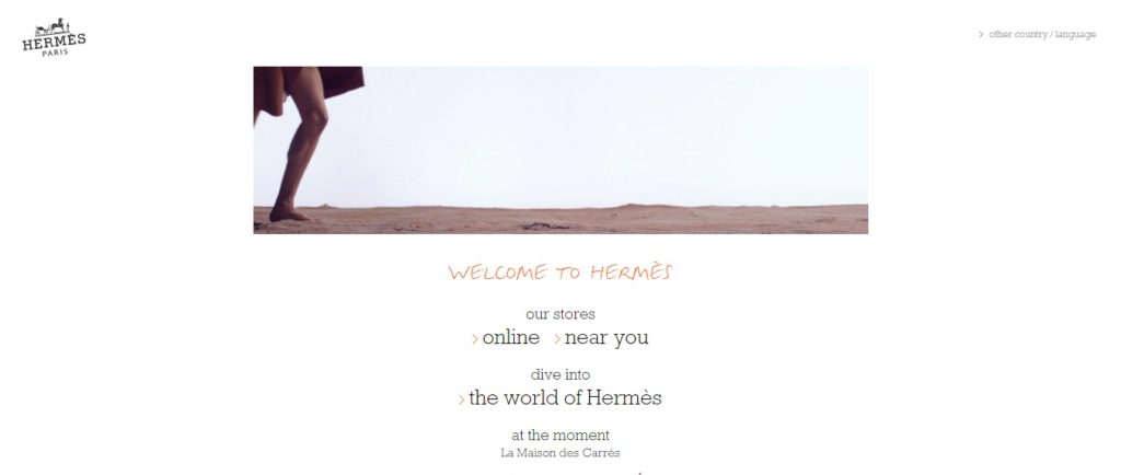
1. Hermes
Hermes is a huge clothing line, so you would think they would be able to invest in excellent landing pages. Unfortunately, a while ago, Hermes product landing pages simply sucked. The problem was when a user clicked on a product; the link never took the user to the intended page.
It is very important to make your landing page content match whatever was promised by the link. If the link points to a page about shoes, do not redirect users to the t-shirt product page, like Hermes did. Doing so will frustrate users, and they will abandon the site. Fortunately, Hermes has learned its lesson and recently redesigned all the landing pages.
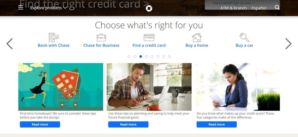
2. Chase
Yes, the credit card company that makes those tempting TV ads managed to make a truly awful landing page for the business’s credit card offers. What did they do wrong? Bad call-to-action buttons. Not only was the landing page cluttered with hyperlinks and text, but the most important CTA buttons were wrongly placed.
The CTA buttons felt like they were designed solely to frustrate the user. A “Learn More” CTA button required three steps to get to the actual learning more. Also, the landing page has not one, but three CTA buttons leading to various places. This is simply confusing and cumbersome.
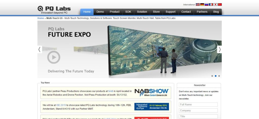
3. MultiTouch

There are many things this marketing agency landing page gets wrong. Let’s start with the horrible hero shot or the main image that the user first sees. The MultiTouch hero shot is only confusing. It shows a guy’s finger with several incomprehensible screenshots on the side. This epically fails to make a good impression.
The second major flaw of this landing page is that it doesn’t understand above-the-fold navigation. The CTA buttons are below the fold, and a list of benefits goes right through the fold. When you design your landing page, the most important information must be placed above the fold.
4. Zendesk
Zendesk, though a reliable brand, makes a terrible mistake by making their homepage the landing page for an AdWords ad. Even if that is forgivable, the headline on the landing page is not. The problem is, the headline does not communicate information about the product clearly to the customer.
Zendesk’s heading is “from now on, everything will be better.” That is a vague and exaggerated statement about nothing. However, the subheading makes up for it by saying what Zendesk does. However, a user has to look carefully. Remember that good landing pages have compelling headlines that immediately captivate the customer and also deliver the point.
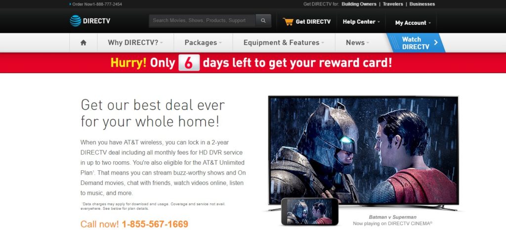
5. DirecTV

DirecTV had a landing page for an ad promoting a new service. The problem: the landing page was cluttered with text about the brand and not the new service it was offering. The landing page simply says “new service” in an image that looks like a CTA button, but is not.
The cardinal sin DirecTV makes is making the landing page pointless and unappealing. If the landing page is for a new promotion, service or offer, don’t pitch in the generic content about the brand there. Have a CTA button ready to give the customers the information they need pronto.
Pay careful attention to the above awful examples of landing pages. Make sure the landing page you create does not make the same mistakes. Keep the design simple and the copy clear and concise to drive conversions.


